Sunday, October 14, 2012

A Studio Visit with Yasmin Spiro By Aya Uekawa

-->
            It was the day of the Brooklyn wide-open studio when I visited Yasmin Spiro.  As she was participating in the event, her works are presented nicely in her studio in Prospect Lefferts Gardens.  When I entered her space, I sensed an 
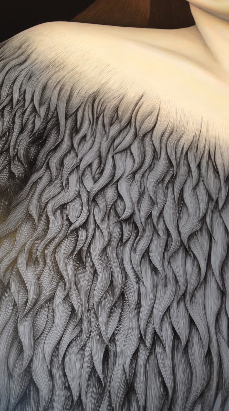
earthy organic scent. It was her large sculpture created with woven jute. It looks like a Rococo style skirt, which was hung from the ceiling at the height of a tall woman’s waist. It is slightly larger than life size, yet is not overwhelming. I could imagine a woman’s torso sitting on it. It was striking to have a simultaneous impact of vision and scent. A few minutes after she opened her studio window, the scent went away.
            It was clear that her signature material is woven jute. She showed me her video piece, which was projected on a woven jute. The image of the video is taken from her trip to Jamaica where she spent her childhood. She took videos of an old railroad near Kingston. As a child, she went there, but she said she remembered some scenes differently. She told me how our memory was fragile and sometimes not reliable, which I totally agree with. Most of the video show a perspective of a person riding on the back of a moving train, looking over the railroad running between green bushes and trees. The video was also taken through the clear vinyl sheet during rain, so the image is slightly distorted with the running water over the vinyl sheet. It is a nostalgic scene to everyone, although the viewer has more than likely never been there. Despite her specific choice of location, the imagery appears rather anonymous. Yet, it is probably why anybody can feel connected to the imagery. The effect of the woven jute is very interesting. The image looks like a detail picture of a painting on canvas, which transforms the image to a dream like, ambiguous landscape. The effect of the rain and saturated colors makes the image look like an impressionist painting.
            She was also working on her new drawing project; maps of imaginary cities. She prints the woven jute on her drawings by painting the jute and presses it against paper. She uses these prints as a ground or a part of the maps of the drawings. The limited pallet of red, gold, and black, leads the viewer to pay attention to details of her drawings.  
            From the works she showed me either on her laptop or in person, I asked her if she was interested in making an installation. She told me about her idea of a small scale, interactive piece. We agreed to keep in contact about the piece till she comes up with a solid vision for the work. I believe her new work will be great to show the diversity of tART artists in the exhibition.

Monday, September 24, 2012

Aya Eukawa: The Feminine through Power & Control (by: Monica Carrier)


A beautiful hot summer day, my daughter and I rode a long, scenic train ride North of the city.  We arrived at a farm and met with the artist Aya Eukawa, her young daughter and her husband, also an artist.

There were bees buzzing around and carrots for the girls to feed to the bunnies. We spent the early afternoon picking strawberries in the vast fields. This idyllic setting was the start of a peaceful and inspiring visit

Following our family fun time, Aya and I got down to business and to the other side of our lives as artists. 

We traveled from the farm over to an old high school building that now serves as studios.  When we entered Aya's studio space, I was overwhelmed at the size and power of female figures commanding the space.  Aya is currently working on two 10-foot tall acrylic paintings of sad, stoic women.  One of them, inspired by German Renaissance painter Lucas Cranach's Venus, is covered in finely detailed hair growing over her entire body, like a depiction of Eve as a feral goddess. This woman also resembles Aya a bit since she used herself as a partial reference - to me this gave the figure even more power. The other figure stands commanding a raging bull with ornate fur painted one tiny line at a time.   For the subject matter of this painting, Aya referenced the horrible ancient Greek torture and execution device known as the Brazen Bull.  Aya's woman stands within the bull accepting of her fate, sad but defiant in her composure.

Both of these figures are larger than life depictions of controlled, female sadness but with power in that control.  They are absolutely reminiscent of early Italian Renaissance figures but with a much more graphic quality so that they seem to move between reality and dreams.  Their perfectly smooth rendered flesh against the obsessive, graphic patterning of their hair and clothes along with the stark surrounding space absent of detail, gives them more mystery than there would be in a more specific setting.  In response to my question about why her figures are almost always these sad, controlled women, Aya refers to her personal history growing up in Japan.  She feels that this kind of control permeates the culture in which she was raised and she found it especially notable in the women of her family. She sees it as a kind of cultural defense and to avoid revealing too many emotions or weaknesses.

Aya will be showing these two paintings, in a three-person show at the Baltimore Museum of Art in March.

In selecting work for the upcoming Spring tART show, I kept in the back of my mind the idea of conversations between works that Jess Levey brought up when visiting my studio.  Aya had a couple of delicate pencil drawings in her studio that I felt brought a similar sense of unintentional communication between the works.  The first is a study for another painting of a head, just a head, with detailed long flowing hair alluding to the thought that this head has just rolled to where it is quietly sitting.  Despite the fact that it is a study for a larger painting it holds the same narrative of stoic sadness. The second is a study for the painting with the bull. It is a profile portrait seeming to look not with shock or horror towards the disembodied head on the paper next to it but simply with controlled regret.  Composure is the dominating presence in all of Aya's works.  Pairing these two drawings maintains the composure of both the victim (of the assumed beheading) as well as the witness to that horror. There is no panic anywhere to be seen despite the panic-worthy conditions.  There is sadness and strength in control. This is true in the stories of the women that are presented as well as in the obsessive, clean techniques of the artist. 


I left with the knowledge that we must keep going, keep steadily working, with our heads held high despite what hardships we face. We are strong, we can breathe through anything and just keep working.


Tuesday, September 11, 2012

A visit to Monica Carrier's Home Studio

On a sweltering summer day, I arrived at Monica's apartment where she has carved out just enough space for herself to make room for art making.  The hand made organizational structures in her small railroad apartment are impressive, as are the fresh concord grapes sitting on the table brought in moments ago from her Brooklyn backyard.

Coincidentally, space is an issue that arises in all of Monica's work, more specifically- the break down of space and the growth that occurs when given just enough room. What is also vital in her process is the letting go of oneself once a structure is decided.

This can be seen in her large works which begin within an architectural framework and then break down as seen here:


This process of letting go within a specific framework is even more apparent within her small ink blot drawings which are incredible. Monica looks at these works as spirits revealing themselves. Since her Mother's incredibly sad passing this past summer, Monica has felt stronger ties to the spiritual world. She has been exploring the readings of Joseph Campbell and has been occupied with studies of myth, shamanism, and the subconscious. These Ink blot drawings are direct results of this developing interest. She creates a structure, as she always has done, but then lets the portrait reveal itself to her within the process of drawing and blotting. Here are a few of my favorites of this work:


Her process reminds me of cloud gazing/shaping, a most entertaining pastime, and I am a bit jealous of her amazing organic process, one which is very different from my own more planned out and rigid methods of art making.  I think we can all learn from Monica's studio practice. I find that it is vital to all artists to learn to let go within our"planned" framework," for that is when the real magic can happen.

Fortunately, Monica also let me make my own shamanic drawing. I am scared to death of a blank piece of paper so it was challenging, and strangely enough I ended up drawing a large swirl which ended up looking like one big phallus, which made sense since I was just beginning to believe that the baby I am carrying is a boy. Monica, finished my drawing for me, and found amazing imagery hidden in it's blots and lines. Here she is working away....

Thank you Monica for an inspiring visit (and for the delicious grapes)!


Thursday, August 30, 2012

Jess Levey's Practice, by Liz Ainslie


When I walked into Jess Levey's studio, I was excited to see several videos set up and playing. An iPad showed black and white documentation of a simple performance involving a woman in an office chair in a cubicle pushing herself back and forth relentlessly between the walls of the cubicle (After the Crash Project, Untitled #4). On the wall was a quieter image made from a photo collage with a video projected on top. The still image looks like a factory courtyard. In the middle of the courtyard, the projection layers an image of a field of grass fluttering in the wind. I think these two works illustrate the range of Jess's work. From works with a direct and concrete message, to works that seem more poetic and mysterious.


Jess works primarily with photo/video collage these days, but her roots are in photography. She showed me some of the early photographs, which involved projections upon objects and people. The photographs were very dramatically staged and well executed.

As we talked, I learned about the project that seemed to move Jess into collage and to focus on the manipulation of images in a somewhat analog manner. After the many lay-offs of 2008, she and many of her friends would never return to the buildings they spent years entering every day. She took footage of the neighborhoods where people had worked and asked them to use paint to black out the building in which they had once spent so much of their time. I like the idea of using a moving image to create a two dimensional mark on paper. The message Jess began with is very literal, but watching the video of each person blacking out their building, this mark-making seems like a quiet action, almost a ritual. (Look under Videos at http://www.jesslevey.com/)

Most of Jess's installations and videos address our interactions with everyday spaces. Her motivations are political in some instances, but I also think the works move into the universal when you encounter them. There is an emptiness in the bleak images of urban spaces, but the projections and drawings transform the spaces. Perhaps she is questioning our perceptions of our surroundings too.

We also discussed the idea of video collage. I like that Jess is combining the physical and virtual in her collages. It's refreshing to see someone using technology as a tool and incorporating it into a unique process. The process is perhaps closer to printmaking than to video. Impressions are formed in paper to create spaces for projections to exist and impressions are made using the projections as a guide.


As I moved through the studio, Jess showed me a more recent piece that took the quiet and mysterious aspect of her work further. A small black and white photo of a desert scene sits on the wall. Behind a tree, a trail of smoke is moving up into the sky. I chose this work for the exhibition, because the scale is surprising for a video collage and it reveals itself slowly and beautifully.

You can see Jess's work here: http://www.jesslevey.com/


Wednesday, August 1, 2012

   A STUDIO VISIT WITH LIZ AINSLIE BY CLARITY HAYNES


I enjoyed my visit to Liz Ainslie's studio in Williamsburg. Her paintings are a pleasure to look at, and they made me think about how paintings are made and the history of painting. The longer I looked, the more I saw, and over time things I didn’t notice at first became subtly compelling. 

What I was struck by right away was the works’ relatively modest scale, and what seemed to be references to cubism, still-life, and modernist abstraction.  Liz and I had an interesting discussion about painters and art history.  She cites Cezanne, Vuillard and Ellsworth Kelly as influences, and is interested in Post-Impressionism and Minimalism.  The base of the paintings consists of neutral colors that might make one think of modernists like Morandi or Cezanne. But Liz is equally influenced by her everyday contemporary world and culture -- hence the interruptions of saturated, almost day-glo colors.  The bright color often takes the form of a line which delineates forms and suggests space, while always breaking down any coherent spatial system. The forms are mostly cuttingly angular.  The neutrals and brights coexist in a kind of harmonic feud, and there are beautiful subtleties of similar values and colors – part of what makes prolonged looking so rewarding.

I was curious about her process.  Liz described it as something both felt and achieved over time: a mixture of research, experimentation and practice. She has a strong background in color theory, but employs an intuitive and personal approach to color made up of particular systems and habits acquired through the experience of working. 

I find Liz's paintings to be rare and refreshing in the context of our times.  They are obviously hand-painted, bypassing the gloss of the digital age. By her own words, she is “not a hard edge painter.”  She avoids a slick facture,  going instead for a handmade look and an almost rough, matte surface.  Brushstrokes are often visible over a warm reddish underpainting.  I feel that the work displays a beguiling combination of humility, vulnerability and restraint.  

The painting I chose for the Collectively Assembled show is one of Liz’s most recent.  The palette is a combination of darks and bright blues, and to me it exemplifies the unfolding contradictions and mysteries of her work.  


To see more of Liz Ainslie's work: http://lizainslie.com/paintings

Read more about her process here: 


Wednesday, July 25, 2012

Studio Visit with Clarity Haynes by Suzanne Broughel


Clarity Haynes is among the new members who recently joined tART, so this visit was a nice opportunity for me to get to know her and her work better. Her studio space in Brooklyn is filled with images of women’s bodies – drawings and paintings.  Some of the paintings are much larger than life size.  Only a specific portion of each woman’s body is depicted: the unclothed breasts, framed by chin and waistline.  She started this “Breast Portrait Project” in 1998, making pastel drawings at women’s festivals – a healing environment where some women chose to walk topless.  She has also conducted workshops with women, using art as a means of self acceptance and appreciation regarding the body.   The invested persistence and evolution of this project show in the nuances of Clarity’s work.  There have been gaps as long as five years where she did not work on it, and the largest canvases – among my favorites – are a recent step. 

I asked Clarity why she doesn’t include her subjects’ faces and she told me that “when you have a face, it becomes about the face”, which is “more narrative, in another way.” Speaking with Clarity and viewing this work, it is clear how central a woman’s breasts are to her body image – and how the depictions of naked breasts that we are used to seeing collectively – in Western art history and popular culture - affect our own self image.  In Clarity’s paintings and drawings, I see the female body in all its beautifully complex realness and variety – not the photoshopped, commercialized, stringently edited versions that are ubiquitous and practically unavoidable. Clarity is particularly interested in affirming women’s bodies as they age, and challenging rigid ideas of “ideal” size, shape, skin tone and texture.  Something that really struck me is that, though this project – in its current iteration - is very much about painting, it is also participatory.  Women aren’t just static “models”.  She maintains a book where the women write down their thoughts on their own relationship with their body – alongside their photo.  I loved going through this book.  Though the drawings and paintings stand on their own, it added rich layers to my experience of them.

The work I am choosing for tART’s “Collectively Assembled “ show is the breast portrait of Roxanne, a very muscular bodybuilder.  This painting raises so many important questions about our assumptions on race, gender, and iconic imagery.  It led to some wonderfully strong conversation during our studio visit.  Particularly after I read Roxanne’s entry in Clarity’s book, I knew this was the painting for the show – and I’ve asked Clarity to include Roxanne’s writing and photo in the gallery.


Sunday, July 1, 2012

A Studio Visit With SUZANNE BROUGHEL by Sandra Mack-Valencia


A Studio Visit With SUZANNE BROUGHEL by Sandra Mack-Valencia


         A long train ride home is awaiting as I leave Suzanne Broughel's studio visit. A long commute that is actually very welcomed as I was left with quite a load of information and ideas to think about. Suzanne's work -in her own words, "is not black or white, right or wrong, but a way to start conversations." That is exactly how it feels after her visit. We just got started, and I am eager to see more, to talk more, to know more. 

Suzanne's ability to make work anywhere frees her from the necessity of having a permanent studio space. Sometimes she works at home, sometimes at a specific site, or just wherever the flow of her artistic routine allows her. For this studio chain visit, I met Suzanne at the Arts East New York Inc gallery, where she is currently showing 2 pieces in the exhibition "Threadz: Untwining Mistaken Messages Within The Fabric Of Hip Hop", which was curated around the subject of the tragic murder of Trayvon Martin and the perceptions of Hip Hop culture.

Suzanne's work is undeniably political. Her pieces are charged and powerful, and also visually striking. It amazed me how she is so passionate about the concept, and so equally concerned about the aesthetics and presentation of the work. Her materials are rather common, and -like she describes them, "easily accessible and low budgeted". You won't find Suzanne at Pearl or Utrecht, she prefers to get her art materials at a Duane Reade, in thrift shops, or just in the street. Her materials go from basketballs, bandaids, and inexpensive t-shirts from unknown brands, to pennies dipped in foundation make-up, braids made of shoelaces and buttons gotten at e-bay.  Her objects are usually linked to a particular culture: the African American one.

Race, racism, categories, labels, appropriation.  All these concepts are constantly in Suzanne's discourse, and one can understand that better by looking a little deeper into her childhood. She grew up in Yonkers, where racial division was clear enough to have little 6-year-old Suzanne feel there was something strange going on. Her house was situated right at the border that divided the white territory from the black one. Her family lived on the "black school district" side of the street, therefore she had to attend a predominantly black elementary school where she had a great time and had good friends, but did not comprehend well why after school things felt different. Her father was not totally comfortable with having his little girl grow up among African Americans, and she did not socialize with her black classmates outside of school. After having to lie about her address, she attended middle school in a predominantly white school, but after that her high school years reunited her with the black friends from her childhood, only by this time,the separation had made them virtual strangers.

We looked at many of her pieces.  Basketballs punched with big holes, referring to both: commercialization of a culture by literally selling pieces of a basketball touched by a Sports Superstar, and also to gunshots. Braids made of shoelaces or t-shirts speak about appropriation of a culture.  Pennies dipped in different foundation make-up colors and then stamped on a white piece of cloth talk about economics and inequality. 

From all the works we discussed, the one I chose for this studio chain exhibit is a work currently in progress. It consists of hundreds of political campaign buttons from different years. Suzanne has removed the political party name and has left only the message.  This is how messages without a specific messenger turn into a marvelous unanimous utopia claiming for a better world.  It struck me that no matter if you are a democrat or republican, left or right, they all say positive things.  I guess after being assigned by Carrie to paint my childhood idea of a heaven populated by all kind of animals getting along, why not to have all politicians getting along as well!
Sandra Mack-Valencia 06/27/2012


Tuesday, June 26, 2012

A Studio Visit with Sandra Mack-Valencia by Carrie Rubinstein


“I’m very obsessive. I like detail, I find joy in obsessive work…I mean I pay someone to clean my house because if I do it, I’ll be there all day on the tiniest square of the kitchen.” When Sandra Mack-Valencia said this to me two weeks ago in her spacious studio in Long Island City, something clicked for me about her work. I am a huge fan of her work and have been since we met in a 2005 Hunter College graduate drawing seminar. Her paintings on board are ornamental, narrative, decorative, and powerful. She uses a standard photocopy transfer method as a point of departure and definitely takes it to another level.
Sandra’s most recent work focuses on the little known but terribly interesting story of King Edward VIII who chose to abdicate the English throne in 1936 in order to marry the wealthy American divorcée, Wallis Simpson. Britain’s governors and its Dominions gave Edward an ultimatum, which led him to choose abdication. Mack-Valencia is fascinated with this love story and created one of her most beautiful pieces which features the couple at the top of the picture, bands of delicate detail work on the sides and a magnificent crown with the word “Abdication” written across it. The center of the work remains empty. Sandra wants this space to be something to ponder, explore and discover in relation to the narrative she has assembled on the perimeter.
Another striking piece in progress relates to this theme of bizarre love stories with the subjects placed more in the present. In 2007, the female astronaut Lisa Nowak made headlines when she apparently wore adult diapers as she drove 900 miles across five states in an attempt to attack her former lover’s new mate. Sandra was drawn to this absurdity and created a piece which begins with the face of Lisa Nowak in photocopy transfer and then expands to use two animals to represent the lovers in the triangle. Sandra is a dedicated animal lover and the sheep and tiger that adorn Sandra’s interpretation of Nowak come across as tender as well as eccentric. The sides of the picture include a wonderful blend of acrylic wash over transfers of rockets that I am so drawn to in Sandra’s work. 
I loved when Sandra got down to the brass tacks of her subject matter and her process. One of early her inspirations came from a mistake back in her time living in her native Colombia while employed at a chemical company. One day she was caught in a rainstorm and a notebook she had became soaked with all the pages blurring together when opened. She was fascinated by this and asked her work colleagues about methods she could learn to reproduce this in her artwork. Thus, she found her way to the transfer process.
Sandra told me of a sweet belief she had as a six year-old girl. She believed that all the animals up in heaven could speak to each other. They have a world all of their own. We talked about this kind of utopia and from that developed the idea of an idea for a future piece in the vein of a challenge: making a piece that only had animals as the subject. I admire how she takes narrative and translates it into something in comical and sympathetic. And I look forward to seeing this animal piece and any others with her specific brand of obsessive tendencies; it produces such rich work.

Wednesday, June 13, 2012

A Studio Visit with Carrie Rubinstein by Jodie Lyn-Kee-Chow (June 9th, 2012) From life, to drawing, to life again

 My recent studio visit with Carrie Rubinstein was nothing short of pleasant. Her live /work space was very tranquil. A contrast to the sounds and sights of her Prospect Park neighborhood which  bursts with such liveliness and activity which seemed to be no distraction for her as she works intimately with each of her series of drawings of architectural rooftops of dwellings amongst plants and city lights.

As I walked in Carrie’s colorfully detailed line drawings drew me into looking closer and examining her surroundings. I wished I was in each of these somewhat imaginary spaces. As Carrie told me her techniques of working I was even more intrigued at her ability to capture such detail and attention to her subject matter from just pure observation from quite a distance away. One would think she climbed her rooftop and used binoculars  to draw such angles of an adjacent  rooftop. I was quite surprised that by working and drawing from her windowsill she was able to capture such detail and intricate spaces much higher than her eye level. Imagination must have come into play which she explained took her about three weeks to complete each ink and gouache drawing.

Having known Carrie since graduate school at Hunter College back in 2004 her work has changed quite a bit since she studied sculpture and used more random materials from wood to cast rubber. Her thesis work which contained life sized gouache drawings of a living room was cut up and arranged into an installation, which she described as 2.5 D (a halfway point between 2D and 3D) remained with me and I related them to her current work by the line quality and her drawing from life. I challenged her to work this way again, not to abandon her older gouache techniques or recent way of working small scale and intimate but to incorporate her previous 2.5 D methods. I understood her space limitations to create a whole large scale installation of these so I told her to imagine life sized fragments of her recent drawings which contained brick walls, rooftops, plants, trees and to consider the viewers' own entrance into these environments.  A nice surprise would be to see where these borderline imaginary/ realistic spaces emerge. From life, to drawing, to life again- a small drawing is magnified. I can’t wait to walk into the colorful world of Carrie Rubinstein.

Tuesday, June 12, 2012

Jodie Lyn-Kee-Chow's Studio Visit, By Rachael Gorchov


On June 2 in the afternoon, I joined Jodie Lyn-Kee-Chow in her sunny studio in Astoria, Queens. I've known Jodie's work for a long time, since we started graduate school together in 2002 at Hunter College. Jodie often revisits themes of the environment, femininity and personal identity - with a visceral silly and clever sensibility.

Last Saturday, Jodie and I discussed her latest work on endangered and extinct species of birds. Jodie started our visit by laying out collages she has been working on: roughly 11x17," these collages are meant to be read like sheet music. She has made corresponding soundtracks for each drawing of the bird songs. When birds share longitudinal space, their songs overlap. We discussed how she hopes to install these collages. She's interested in creating an intimate space where viewers can "dial up" the song for a particular collage using a device similar to what one might use on a guided tour of a museum.

Additionally, Jodie showed me some drawings in which the birds "spoke" their names in speech bubbles.  She felt this iteration of the collages, still in sketch form, had room to evolve.  We discussed how Jodie might integrate the drawn elements of the speech bubbles with the collaged birds.  Jodie might experiment with painting the speech bubbles rather than writing them.

After talking about the drawings, we took a look at another project she's working on. Continuing with the theme of endangered birds, Jodie has created the beginnings of an installation in which she will hang hundreds of paper cutouts of a single bird species, creating an immersive environment. When talking about this project, we discussed how the pixelation of the enlarged digital image seems sad and ephemeral, echoing the state of the bird on this planet. We also discussed options for integrating her picnic blanket work into this piece: creating a comfortable spot under the birds where the viewer can lie down, look up and be immersed in experiencing the many birds.

We also discussed how Jodie could merge the two projects. She could create a soundtrack of the birds hanging from the ceiling so that the viewer has a multi-sensory experience. Jodie mentioned an idea she was playing with - of mounting the birds on a slowly rotating disco ball motor so that they remain in motion.

Between now and the upcoming Collectively Assembled show, Jodie plans to continue developing both of these projects. I was excited about both of them and gave her an "assignment," like I received on my visit with Georgia. This assignment was to continue working on both of these projects and install the next iteration of one, the other or both in the show. Of course, I'm sure Jodie would continue working on these regardless, but we both agreed that deadlines help. I can't wait to see where this goes.

-Rachael Gorchov

A Studio Visit with Rachael Gorchov, by Georgia Elrod


I visited Rachael Gorchov's studio in the East Village on a sunny afternoon in late May. Having seen little of her work it was great to talk about what she's been up to. Rachael recently returned from a two month artist's residency in Colorado and came back with lots of new pieces. There were two bodies of work displayed in her studio: ceramic sculptures and painted paper mache and burlap sculptures. I was first drawn to her ceramic pieces: glazed wedges, cones, shapes. The physicality of this work seemed both soft and pointed, elegant and unusual.  They were hung together on one wall and were engaging en masse and could also hold their own alone. Full of rich colors and bits of painted imagery, I could decipher small landscapes hidden among more abstract brushwork and glazes. 


Her other recent works were painted burlap pieces, also hung in relief from the wall. These were more obviously playful with bold colors and marks. As in her ceramic work, small landscapes are painted in unusual places and surrounded by abstraction. Upon first look these landscapes blend in, but soon emerge as representational gems and conceptual entry points. These small landscapes reveal specific references; they are places along the New Jersey Turnpike that Rachael has seen over and over again. Rachael paints these from imagery mostly found on the internet. The abstraction that dominates the piece serves as a frame for the small image. We discussed how these pieces comment on place, travel, and how imagery functions as reference. Talking about this work we both thought it would be interesting to take them one step further, either into total abstraction or into an even more deconstructed state. After my visit with Asya Reznikov I decided to ask Rachael to pursue a series as well, using this work as a starting point. I'm really excited to see what she comes up with!


- Georgia Elrod, June 2012


Monday, June 11, 2012

Georgia Elrod's Studio Visit: May 25th, 2012 by Asya Reznikov


We met at Georgia's new studio near Prospect Park. I hadn't been familiar with Georgia's work and was greeted with lots of oil paintings. They range in size from a couple as small ones about 4x4 inches to very large works roughly 4x5 feet. The paint is very thinly applied and some paintings have the luminous quality of water colors. The colors are predominantly pastel. I wouldn't call them abstract because all of them have an uncanny quality of vaguely bearing resemblance to something -- but I was not quite sure what. Georgia told me that she does not work from specific imagery. Instead, her paintings are the results of a collective imagery that she has amassed from personal observation. The imagery is reminiscent of ornaments, decoration, and opulence in some works while other pieces appear to be about animated computer keyboards. Georgia has developed her own language that, because it seems recognizable, causes the viewer to want to continue looking in an effort to decipher her code. However, the paintings do not offer concrete answers and because they are rewarding to look at, I was not disappointed, but rather perpetually engaged. 

Georgie's paintings also have a delightful humor to them. One piece, "Lifeboat" appears to be depicting keyboard keys at a theater. Another work, appropriately titled, "Stacked" has a lot of different textures "stacked" atop one another as in a layer cake. Georgia also makes works on paper -- also in oil -- some of which were cut out with curved edges. She had two small works that looked like they could be details from another work and I asked is they were a pair. She said that she has not worked in series but is interested in it. This is where I saw a fertile area for her to create something for our show and gave Georgia my assignment/selection for the Collectively Assembled exhibition. I look forward to seeing what she cooks up, not only for our show, but also for her upcoming solo exhibition opening September 14th in Hudson, NY.

-- Asya Reznikov

Thursday, June 7, 2012

Asya Reznikov Makes a Splash!—Studio visit with MaDora Frey—May 14, 2012

I first saw Asya Reznikov's work at her show "Baggage Claim" at the Nancy Hoffman Gallery a couple of years ago and was familiar with her work in installation form. Upon entering, I got a refresher - beginning with her ambitious piece comprised of a 15' tall monolith of
television monitors. An endless escalator traversing several of the monitors making up this artwork, was both memorable and captivating. Next, Asya showed me a wall-mounted piece. In this work, she can be seen traveling, alternating between states of transparency and opacity, depending on whether she is in between destinations or has arrived somewhere. These works typify the themes that interest her most: travel, language, culture and the shifting of identity that results from growing up in different countries.

Asya's new work was what I would like to select for the forthcoming tART exhibiton at AIR@Renaissance. Curious about how the demands of recent motherhood had impacted her studio practice, I was happy to hear she just finished a solo show at Susquehanna University and has
remained prolific in her art making. When I asked about new work, Asya produced some photographs taken during her pregnancy.  My favorite is an outdoors summer scene with a swimming pool in the foreground, and grass rolling-up to a house in the distance surrounded by blue sky. It is bucolic—except for the strange something in the pool. It takes me a moment to realize it is not a Loch Ness rising from the water but her late-term belly protruding as she floats on her back.  We laugh about
this image. She shows me two other images taken near the end of her pregnancy. Again they possess a similar quirkiness. Although these works are still images, they share the same expression and narrative
quality as her video work.  The invisibility of the subject conveys a state of uncertain identity, and describes the uncanny feeling that results.

Wednesday, May 23, 2012

MaDora Frey's Studio Visit: May 11, 2012 by damali abrams

MaDora Frey is taking everyday objects and creating breathtaking photos with them.

MaDora walked me through her website, where her new body of work consists of photos of found objects such as shattered mirrors, concrete and fabric. Through her process of photographing these items and creating mirror images of them, she has found a way to make man-made objects look organic and to make elements from nature appear architectural. The images seem complex but the process is very simple. MaDora calls these images Rorschachs and if the pieces seem to resemble one thing too much, she alters them in some way.

MaDora photographs these objects outdoors and feels liberated that she is able to move away from he usual practice of painting in the studio and get outside into nature. Terms she uses to describe her work include intangible spirituality, kaleidoscopes, otherworldly, slick and glassy.


For the upcoming Collectively Assembled exhibit, I suggested that MaDora pursue her idea to turn these pieces into sculptures. As Anna Lise challenged me to create work using dance and large scale installation, I passed the challenge onto MaDora to allow herself to work in another discipline.


Tuesday, May 22, 2012

damali abrams' studio visit, May 2nd, 2012, by Anna Lise Jensen

I recorded my visit with damali and you can listen to it here. We looked at texts she had just submitted to Push, The Zine and diary readings she was editing for upcoming exhibition at Spattered Columns. And damali told me about work she makes but doesn't show that relates to longstanding passions of hers, I never knew about: dancing, choreography, collage and the work of Romare Bearden. This hidden work of damali's is what I picked for Collectively Assembled.  When Petra Valentova visited me, I had just returned from a community garden visit with a fellow artist and friend, Michael Wilson, and this inspired her to suggest outdoor audio installations and cross-polinating gardens in terms of food and people. Quite a mouthful as I have never done outdoor audio but also exciting suggestions.  Listening to damali's hesitations about showing certain work, I thought of Petra's brainstorm of my behalf and this influenced my choice: as a support structure, our collective can offer encouragement and a safe environment to explore work we're itching to do but at times have been told we shouldn't. Petra and I were able to wrap up my studio-visit going out for lunch but I didn't have time for that when visiting damali. In stead I managed to bring the driest cakes ever but luckily damali had red velvet cakes waiting that went well with the non-dry beers I also brought. I'm sharing this tidbit for future studio-visitors as it's so enjoyable to be able to spend time together doing a studio-visit, and combining visit with food and a drink simply adds one more enjoyable dimension.


Wednesday, May 9, 2012

Anna Lise Jensen's Studio Visit: April 21, 2012 @ JCAL - A chain link visit by Petra Valentova

I met with Anna Lise at the Jamaica Center for Arts and Learning (JCAL) where we are both participating in a tART exhibition, Collectivity: Art Making in a Collective. During my visit I saw her current work as well as her work from 2004, a series of portraits by herself and students at K’ipay, a school for the mentally disabled in Bogota, Colombia. At the JCAL she exhibits large print from new series as well as a page that lists events she’s organized in connection with the JCAL exhibition. In her new work Anna Lise explores the Jamaica neighborhood in Queens, with a focus on the writer Paul Bowles who was born and raised  in Jamaica (Queens). Later in his life he  traveled the World and choose Tangiers, Morocco, as his new home. Both Anna Lise and I grow up in another country and choose NYC as our new home. Relocation is our every day reality and in many ways an inspiration for our work.  Anna Lise grew up in Denmark, me in Czech. During our talk Ann Lise expIained that she found interesting how we at times are blind to the the parts of our own place of origin that makes it attractive to visitors, travelers and transplants. In her new work she translates relocation thru a process: first she chose text from Bowles writing on Tangiers and juxtaposed it with photographs she made in the places related to his time in Jamaica. Here, her chosen Bowles quote on Tangiers, placed under an image of an idealized Forsythia branch by Jamaica High School that he attended, states: "it is delightful, too, to step out into the silent moonlit street". Although I didn´t translate the photo as being done in monolite, I loved both the image and the text.

On her note of listed activities, hung between above mentioned image and the K’ipay portraits, is a collaboration with the 50 Cent Community Garden in Jamaica and Michael Wilson, an artist she met through an open call at tART’s last exhibition (at Arts@Renaissance, Brooklyn.) She introduced Michael Wilson to the three original founders of the garden in Jamaica, and while he’s making a portrait of them, she is recording her conversation with the gardeners for an audio piece. At the closing for the JCAL exhibition, she will reveal Michael’s portrait to the gardeners and hang it on the wall where her Bowles image is now - by then this series will exist as a book. At the end of the JCAL exhibition, Anna Lise, together with the gardeners and Michael Wilson will organize in the gallery a Garden Salad picnic, where she will serve produce from the community garden,  and celebrate. This event will be  open to all.


For tART’s Collectively Assembled exhibition in 2013, I like the idea of Anna Lise’s Garden Salad picnic. I would also like to see her to create an audio piece focusing both on the Jamaica gardeners as well as on local community gardeners near the JCAL. Ideally, I would like to have these audios installed in both gardens, even if just temporarily. It would also be wonderful to throw in some summer picnics with the help of local products from both gardens. This also links our studio-visits: in my own studio visit with Katerina Lanfranco, I showed my yellow duck – a sculpture that is directly linked to Anna Lise’s beloved community gardens. In 2010, I proposed it for her project A Lot of Possibilities, and she showed my duck proposal at her WinterSpace, along with other artists’ proposals for NYC community gardens. Based on her recommendation,  I applied for and received a Queens Art Council grant to realize the duck. This year, it will go into a community garden in Long Island City. The curious links between Anna Lise and me now include studio visits, a huge duck and a community garden salad. Yummy.

Thursday, April 19, 2012

Petra Valentova's Studio Visit


Petra Valentova's Studio Visit: April 13, 2012
A chain link visit by Katerina Lanfranco
Entering in the Petra's light filled studio in L.I.C., I can tell right away that there's been a lot of creative activity since the last time I visited. Evidence in the form of art work and projects fills my mind's eye, even before we start talking about Petra's new work and many artistic endeavors. In the middle of the studio is an over sized cute but slightly menacing (in its raw in-progress form), rubber duck. The duck model is made of styrofoam (for the core) and plaster layered over it. The duck will eventually be made of plastic or metal depending on various factors. When finished, the duck will live as a permanent public art work in a NYC city park. Petra uses styrofoam in other ways too. She makes cutout 3/4 sized figures as sculptures or interactive installations. While Petra's artwork is meant to exist in many different viewing spaces; public, private, museums, interactive installations, galleries, art festivals etc. - her aesthetic has a consistent minimalist sentiment combined with direct and oblique autobiographical references. Even in her more ornamental 2D work there is still a direct minimalism at work: high chroma colors and specific repeating, often geometric shapes. As an artist, Petra does not fuss around with a lot of color mixing or minute variations. She does however, constantly refine her conceptual approaches to her work and to her approach to being an artist. I imagine that an ideal contribution for the 2013 art exhibition Collectively Assembled would be something that combines her interest in both 2D and 3D working methods.
To see more examples of her work please look at her website at: www.petravalentova.com

Monday, March 26, 2012

studio visit with Katerina Lanfranco selected by Julia Whitney Barnes

Katerina just completed a massive installation at the University of California Santa Cruz described as an "imagined landscape installation of hand-cut trees inspired by a cross between American and Japanese impressions." Upon her return to NYC she gave an artist talk about her process which included a six month residency in Japan where she studied Ikebana among other Japanese disciplines. I was most struck by her depiction of 13 trees, which filled the whole gallery and appeared transform it into a tree-shrine of sorts. I selected one of these of tree cutouts that can be recontextualized for the tART show.

Here is a link to a video where Katerina leads a walk through of the installation:
http://vimeo.com/38826348

There is a wealth of imagery and info on the blog for the exhibition:
http://naturalselectionartshow.blogspot.com/

As well as her website:
http://katerinalanfranco.com/home.html

Tuesday, March 13, 2012

Welcome to Our New Blog!

This Blog will document tART Studio Visits and members selecting work for Collectively Assembled, 2013, an exhibition curated by Yulia Tikhanova. Eact studio-visit informs the next.