Friday, January 18, 2013

A Studio Visit with Julia Whitney Barnes by Susan Ross


DECEMBER 2, 2012


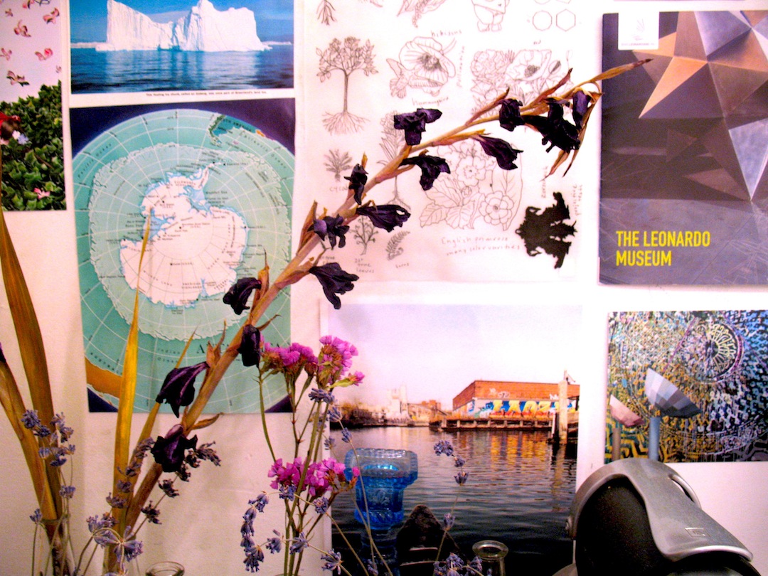
Entering Julia Whitney Barnes' studio in Red Hook, Brooklyn, I encountered a world of interconnections, a feast for the eyes. Two of the walls are covered with rich source material, including studies, photos and reproductions of images of animals, plants, architecture, a favorite painting: Pontormo’s Visitation and a view from her studio window in Italy.  Surrounding herself with this imagery, Julia explores relationships between art, science and mythology, and natural and human-made worlds. Integrating her ideas, she flexibly moves among oil painting, printmaking, ceramics, mural painting, mosaic work and installation, creating studio and public works. Her work is influenced by ecological practices and the complex relationship humans have had with the environment throughout time.
For Collectively Assembled, I chose a painting in progress (oil paint, ink and watercolor on linen stretched over wood.) This piece explores private vs. public and is a good fit for the unique A@R space with its reconverted showers, green areas, courtyard and public programs. Initially Julia associated the blue atmosphere with the sky, but after Hurricane Sandy this aquatic color took on new meaning. The prison-like tower is a remnant from an abandoned amusement park. She incorporates the labyrinthine floor pattern of San Vitale in Ravenna, leading our eye back to the center of the painting. Its perfect triangles have been made irregular with the passing of time. We also see nature at work on the contemporary fence in the foreground. Julia observes, “Nature permeates human-made structures. Humans build barriers, yet long for reunification with nature, a constant cycle occurring throughout centuries.” The adaptable trees, growing through the fence, have been cut down to truncated branches. The trees weave in and out of the fence, itself a woven form. Repeated triangle and diamond patterns bring the eye around the entire painting.

A diptych, Star Island (hand-colored etching with shellac-based ink and watercolor,) will also be included in the show. Star Island is a real island off the coast of NH, where Julia spent time as a child. In this diptych, she explores how the isolated feeling of the island is conducive to fantasy. The atmospheric pink coloring breathes throughout both images like the sky at dawn or dusk. The star print fuses patterns from various cultures, including Celtic and Islamic. Julia is interested in how patterns affirm universality among cultures and are distilled from nature. She creates patterns within patterns and the star arrows are multidirectional and continuous in movement. In the landscape print, Julia explores her love for the work of Patrick Blanc, trained botanist, artist and creator of vertical gardens. She loves the ecological benefits of vertical gardens, planted on building walls, and how these beautiful creations grow and change over time. In this print, she also explores her fascination with a unique geological structure, a karst formation in Phang Nga Bay in Thailand. This rock formation has been transformed by the rise of fall of the sea level. Time and natural processes have turned it into a vertical garden structure. A ghost print of a spiral staircase weaves around this image, creating an energy field.
It was wonderful to see Julia and her work, and to learn about her inspirations. I look forward to future studio visits!
Julia Whitney Barnes has been a member of the tART Collective since 2006. She is on the faculty at Adelphi University. To learn more about her work, visit www.juliawhitneybarnes.com


Susan Ross Studio Visit by Deborah Pohl


I visited Susan Ross’s 4th floor studio in Greenpoint on Sunday, November 11, in the early evening.  The hurricane pushed back our visit for a week, and I was so happy to be there and get back to normal life. Walking in, two walls of paintings created an atmosphere of color and rhythm, the work collaborating into a large installation.  My first impression was of color and of lots of amazing paintings and I was worried about picking the work for our show.  I tried to spend time with each piece as I walked around the room.  Each painting has a lot of individuality and its own contained rhythm.  Susan creates each piece starting with one color and slowly layers other colors and shapes over it, over many sittings, until it’s done.

Looking around the studio you can see some of Susan’s influences, with lots of books, including one on Arthur Dove and one on Indian miniature paintings. Susan shared reference photos taken in the course of daily life outside the studio.  Her influences are all indirect as she is looking for a feeling. Susan grew up overlooking the Hudson River, where the river and the cliffs and the sky would create blocks of colors.  Her work is informed by nature but not a literal interpretation of nature.  The energy of the piece is what’s important and its feeling.

As I suggested the first piece my confidence was bolstered as Susan reacted strongly.   It became really fun as we started moving the pieces around by choosing one piece and then another and then pretty much we were playing with the different paintings and putting them in different sequences.   Surprising how much one painting’s color and composition is affected by the work surrounding it.   I was going by color and Susan suggested trying one I never thought would work, and it really made the whole group come alive.

Susan’s work is dynamic and rhythmic. The pure color pulls you in as you become involved with the movement.   Placing the paintings side by side they start to talk with each other and you see the shapes move beyond the paintings.  The paintings are evocative of nature and at the same time, if you let them, personal projections. The oil color is beautiful and delightful to look at. I think you always learn about your own work when you really look at others’ work. We talked about our studios and how making art is affected by your life and working it into your life.  I think visiting each other alone creates a different dynamic allowing you to ask in-depth questions, share personal reflections, and really get to the bottom of an investigation.  We also discussed how to make art and balance it with all your other life roles, and inventive tactics we can use to support each other.


A visit to Deborah Pohl’s studio by Sydney Chastain-Chapman


On the evening of Nov. 13th, I paid a visit to Deborah Pohl at her studio in the Neumann Leather building, a studio building in Hoboken, NJ. As fellow Hoboken residents, we spent the first part of the visit discussing our experiences during Hurricane Sandy. Deborah’s story was much more dramatic than mine, including a rescue by the National Guard. But I was relieved to hear that like me, neither her studio nor her apartment were damaged by the flooding. This was actually the second visit I paid to Deborah’s studio, having gone there during the summer of 2012, along with Anna Lise Jensen, for a very enjoyable, informal studio visit/ lunch hangout. So it was interesting to revisit work that I had seen at the summer visit, and to see the progress Deborah has made in the meantime.
Her primary recent focus has been on ‘the Pill Project’, which she started in conjunction with a Hoboken arts event by the same name, which was a benefit to support womens’ reproductive rights. For this event in the summer of 2012, Deborah started producing small “pills”, i.e. drawings, that she sold at the series of evening benefits, with the profits all going to Planned Parenthood. After the benefit was over, Deborah decided to continue her Pill Project, with the idea of exhibiting the pills as a large collection at the next tART exhibition, and allowing the public to purchase the pills individually, with the proceeds again going to support reproductive rights.


Despite all the interesting social-political aspects of the project, I was most struck by the dazzling visual array of the pills as a group, and loved the chance to spend time with this large collection of tiny drawings (several hundred), to slowly notice the subtle and not-so-subtle differences amid the grouping. The pill drawings are all circular shapes, done in a variety of media and colors. Some are on plain white-paper backgrounds, and some have painted or drawn backgrounds. A few are even collages. Intrigued by Deborah’s process and formal decisions, I brought up those aspects of the work, and that constituted most of our conversation. Deborah said that when she initially began making the pills, she was drawing them to look like more-realistic pill capsules, and even tried making small pill sculptures. This flexibility and willingness to try whatever material and form fit the idea seems typical of Deborah, whose body of work includes realistic witty still-life paintings, abstract works, and various forms of social engagement and performance. But as she experimented with making the pills, she realized the simpler format of the circular shape on a square background was preferable. I agreed, since seeing the group of pills definitely made me think of medicine and birth control pills in particular, but also a number of other more universal ideas, such as a galaxy of planets, or a group of cells.

We talked about Damien Hirst’s pill representations, and Deborah noted that his pill paintings are very regimented and almost manufactured, since his assistants do the painting, whereas her pill project is much more organic, allowing for new ideas and ways of making to come in along the way. We also talked about how working on a collection of small works on paper (something I’ve also done) is a great project to do when you’re busy with other things. Deborah is currently working and also getting a graduate degree, so the pill project has helped her sustain her studio practice in a manageable way during a busy time.

I’m very glad I had a chance to see this work develop over the course of a few months, and that the public will have a chance to view it again at the upcoming tART exhibition, and to participate in the important exchange of buying pill artworks to support womens’ reproductive rights.

A visit to Sydney Chastain-Chapman's studio by Elsie Kagan


I took a trip out to Hoboken on a sunny mid-October day to visit Sydney at her home studio. She is currently creating work in a petite space tucked into her apartment, awaiting a move this winter that will allow her to spread out a little more.

Her space constraints have dictated that she focus on paper-based collages, which are a critical part of her image-making in any case, and a big source of ideas for her larger, painted works.

The works she showed me continue to explore themes and ways of image making that have been part of her working process for a number of years. They are made up of compilations, piles, collections of patterns, figures, and objects, all sharing space and coming together to describe an environment that exists somewhere between desire, aspiration, and reality.

The works in her studio were all single, female figures that were surrounded by carefully collected and constructed worlds. There are handbags, arranged botanicals in vases and urns, furniture and other references to interior design, and of course the figures themselves. The women are all bedecked in complicated and elaborate clothing and accessories, and sit self-consciously and alone in a world of their own creation: things they dress in and gather around themselves to help describe their identities and exert aesthetic control. And while there could be some amount of freedom and self-expression in that process, I discussed with Sydney how they seemed to me to be quite uncomfortable, removed, and unsuited to their choices. Admittedly, I know nothing about fashion and am highly biased towards function over form when it comes to clothing. But putting that aside, the women in Sydney’s current collages appear uncomfortable and encumbered by their garments, and some seem truly trapped. I also thought the issue of aging is playing out in the current work, since the women are maybe a little old for the outfits they are wearing, and often gaze to the side as if embarrassed or yearning for a kind of youth that has already come and gone.

Indeed, much of the work that Sydney has made in the last few years challenges me to think about the ways we use the things we wear and own as signifiers for who we want to be, as a way to broadcast to others how we want to be seen, how we wish we were and who we want to associate with (I think of pinterest here, as one venue where this tendency endlessly unspools).
There is one very funny, and compelling painting on Sydney’s website that I feel confronts these issues in an especially wry way: it is called, “The Collection”
In it, we see a couple proudly standing beside a collection of maybe pre-Columbian statues. While the image brings up a lot of questions about ownership, privilege, collecting, and the function of art in our lives, I am also interested in the way the wife is placed perfectly behind the collection as if she is literally his trophy, his hands on her shoulders in a manner that seems a shade problematic.

While there is a lot of content going on in Sydney’s work, it also bears mentioning that it is compelling and complex on a formal level as well, as the various perspectives, surfaces, texture, and colors fight and work with each other to make up the whole. There is a lot of playfulness and openness in the way the images are drawn and put together.

Considering Sydney’s work and work-space are in flux, we decided not to identify a particular piece just yet for the show. I feel like the women in Sydney’s collages are doing some soul searching right now, and look forward to seeing what’s on their minds next. 


Elsie Kagan’s Studio Visit by Melissa Staiger


Second Sleep” acrylic and oil on canvas, 60” x 60”, 2012


Elsie’s energetic mark making and almost undoing of images with paint strokes and overlapping depictions make me question memory, time and location.  I was struck by the composition of “Second Sleep”.  It uses the white of the painting that divides the composition into almost three sections.  The very dark night painting and contrast of the raw white canvas leads your eye to contemplate the reason for such a strong gesture.

Than Elsie told me what the title meant…

Back in the day, when Europeans were in rhythm with the cycles of the sun and the moon, they used to go to bed when the sun went down.  When winter rolled around going to bed meant they would go to bed at 5 or 6pm when it got dark.  Their pituitary gland that regulates sleep would wake them up in the middle of the night because the body had rested. So around midnight or 1PM they would wake up get some work done and then go back to sleep until the sun came up.  They called this second sleep.

We talked about having children and how parents find themselves awake at weird hours doing things similar to second sleep.  Kagan also let me know about a class she took at Creative Capital called “Strategic Planning for Artists” were she was given the idea of scheduling paintings to get more work done.  Having two children and being a full time artist, this concept proved brilliant in Kagan’s studio.  She was preparing for a solo show and had several square and rectangular paintings to show me.

Her style of painting uses space and overlapping images and loose brush strokes, which give many entrances and exits in the painting.  I found myself on a journey in her work by wondering in the subtleties and transitions from one color or from a smooth line to a more jagged line to having a feeling of seeing a dog morph from one dog to a different dog.

When she was nine years old she lived in the Netherlands and visited the Mauritshuis Collection, where she was enchanted by tiny oil sketches by Franz Hals.  Kagan comments, “His big paintings are weird and mannered but his loose small ones I found absolutely magical.  There was one of a boy smiling, and one of a little sparrow.  I realize that part of the appeal might have been that they were hung lower on the wall panels (at eye level for a little girl).”  The Franz Hals paintings had such an impact on Kagan that the idea of the loose line is seen in her paintings today.

Loud barks were heard during the visit as there is a security guard dog kennel behind her studio.  Many dogs are in her recent paintings, subconsciously from hearing the noises they make and from taking her children to the park and seeing many different kinds of dogs.  Animals are a theme in her work as Kagan once lived near horses and she painted a series of paintings where they appeared.  Horses and dogs both have super senses that humans don’t have to the same extent, like smell, sight and a range of emotional intelligence. As an artist Kagan has this special other sense in her paintings. Go and see this magic in person for her one-person show at 129 Rivington in Manhattan on January 11th 2013.

A Studio Visit with Melissa Staiger by Suzanne Bennett


My visit with Melissa Staiger wasn’t a ‘studio visit’ per say; we met at the Janet Kurnatowski Gallery on Norman Avenue in Greenpoint where Melissa was having a solo show entitled “Triangle Works”. Stepping down into the gallery on a sunny brisk Saturday morning, I was instantly taken by how well the paintings occupied the space. The dense, colorful paintings looked powerful on the stark white walls – the contrast seemed to satisfy both the works and the room itself.

The paintings embody certain themes that have preoccupied Melissa over the past few years – triangles and the dynamism of geometry and color.  This group however was more bold and stark than work I’d seen before. The compositions were larger, the use of lines minimized. They were composed deep reds, blues, blacks & greens. The nuanced and idyllic quality of some of Melissa’s earlier works was not evident here. In fact there was an aggressive quality to these paintings – I likened them to teeth in some cosmic maw.

Melissa and I discussed these aspects of the recent work – she said she was interested in moving into new territory, in pushing boundaries, both in herself and on the canvas. Her previous approach had been rather rigid, guided by a set of rules she set for herself. With these recent paintings, she had relaxed the rules and was letting intuition guide the paintings more in regards to color and space. She found relief in this. She also talked about the associations between math, geometry and cosmic forces. Melissa’s other career is doing body/energy work and we talked about some of the grand themes that guide both holistic healing and painting – movement, the balance of positive and negative, the engagement of both intuition and knowledge.

What I really liked about this recent direction in her work is that she was not afraid to go bold – the paintings do not rest quietly in some pleasant place, they are right in your face, even a bit difficult to absorb, especially on first encounter. There is little respite in all those hard lines and deep sharp points. But there is a life force there - they are in dialogue with both the angels and the demons and they still manage to keep their calm.
The more you look, the more the sharpness attenuates and you feel the space between the shapes open up, beckoning you in to a new kind of thought, a new kind of balance.


A Studio Visit with Suzanne Bennett by Ann deVere


I first saw Suzanne Bennett’s paintings over a year ago when I loft sat while she was on holiday.  One hung over the bureau where I turned the radio on every morning. Impressed by the skill and strength of the painting, I found myself being repeatedly pulled into its space, transfixed by the possibility of narrative and nostalgia. I would later discover the strong emotional residue I couldn’t quite put my finger on as a constant thread throughout her work.


The visit began with her presenting a body of about 18 new paintings ranging in sizes of 14 X 18, 16 X 20 and 18 X 24 inches. The subject was American sitcoms in the 1970s.  She had appropriated stills of characters from such famous 70s shows as Mash, All in the Family, the Brady Bunch and Fantasy Island-to name a few.  This topic became of interest when a childhood memory she had was in fact a memory from a TV show in her early youth.  Her father, who had difficulty hearing and passed away last year, had filled their home with the sounds of a constantly playing, loud television.


She equated-for a brief moment- the passing of her dad with influencing this theme. She also felt nothing complex in the ideas behind studying these figures from a specific period of American history.  I begged to differ as the depth of her critical eye became apparent when I asked if she could define what was so American about the 70s.  She spoke about a last gasp of innocence and freedom existing then before the ironic 80s; how there was still a theatrical quality to television stages with nuanced lighting and muted colors; and how serious subjects on the changes surfacing in our society-at that time, were being tackled in these corny and banal TV settings. To further illustrate these thoughts she pointed to her paintings and began describing the compelling programming behind them. One Day at a Time was a show about a recovering alcoholic, divorced- with 2 teenage daughters who was learning to navigate life alone, while All in the Family portrayed a white, working class bigot losing his battle to progress and multiculturalism, and Three’s Company was about 3 people living in wedlock. The male character self identified as gay so he could live as a heterosexual with a woman to whom he was not married.  Even The Brady Bunch was breaking new ground with a storyline about second marriages and the trials and tribulations combining two families. I laughed and cringed at the same time as I listened to her revelations. 
Suzanne was raised in Northern California and spoke honestly about remembering feeling a bit threatened by the urban shows. I, on the other hand, spent my first 5 years in what is now known as the South Bronx before moving out to the boondocks of New York State. I had a good childhood. I also recall nothing fictional about Archie Bunker from All in the Family. Being the first black family on our street, he was alive and well, living in the house next door and inside the body of the 6 year old sitting next to me in 2nd grade. The discussion triggered recollections of other 70s sitcoms like The Jeffersons, Sanford and Son, and Good Times. We left the topic with Suzanne considering scenes to add to her series from those shows as well.
 
 
There is a strong literary component to Suzanne’s painting. For one, she has a very impressive library of both academic and creative writing. I always wondered what influence that might have on her work. Deeply inspired by poetry, she summed up her intent in painting as capturing the feeling one walks away with reading a descriptive narrative about a place or character. Her response reminded me of the Da Vinci quote “Painting is poetry that is seen rather than felt, and poetry is painting that is felt rather than seen.” Suzanne’s paintings are both felt and seen.

While it was evident the influence of these shows on her aesthetic (the antiquated palette) and mood (a sense of innocence lost), what wasn’t obvious was that in the process she rediscovered her love of painting.  A result, she explained, from being immersed in the conscious decision of how she was manipulating the paint to depict flesh tones, lighting and dimension. She found herself focusing on traditional techniques for ambiance rather than her usual concerns of balance and design.  She described the experience as “working very hard yet having a lot of fun, and fast paced without the suffering”.
 
The American painter Rauschenberg saw beauty in everyday objects. Bennett sees the beauty in the pragmatic rituals of everyday life.  Routine not necessarily filled with big heroic acts but iconic moments nonetheless that quietly capture the humanness of our experiences.  The brilliance with her imagery is you don’t have to know the subject directly to feel the poignancy of longing bred by memory.  The work is also very timely as it mirrors the pulse of change occurring in American culture today.  Changes brought on by the collapse of structures and ideology that no longer sustain us and the expansion into new territories afforded by technology.


I look to the tART collective as a platform to take risks I might not have the opportunity to take otherwise.  As I shared this with Suzanne, it led the discussion to her exploring installation ideas. Provoked by the presentation before me -work hung in no particular order on the wall, sprawled along the floor and placed on other objects, I pointed out how I saw the paintings creating an environment. We discussed the prospects of replicating a room from the 70s, or a television set inspired by a scene in one of her paintings and placing her work in this staged space - a befitting solution to an upcoming exhibition occupying the abandoned spaces of a once vital institution.


Wednesday, January 16, 2013

A Studio Visit with Ann deVere by Katherine Keltner


Studio Visit with Ann deVere
November 29, 2012
Robert Blackburn Printmaking Workshop

I had a wonderful visit with Ann deVere at her printshop and following in a quiet studio. She gave me a thorough introduction to the Robert Blackburn Printmaking Workshop including its and Robert Blackburn’s history. As someone who has eagerly experimented with printmaking when I have had access to facilities, I very much enjoyed seeing the various presses and techniques – lithograph, etching, letterpress, monoprint. This morphed into a discussion about experimentation and printmaking which is central to Ann’s exploration of art-making. Printmaking requires proficiency with technique certainly, but Ann is careful not to let her work become technical; she prefers to look at printmaking as an investigation of material processes – something I compared to mixed media as she took me through some of her work and I saw the multiple processes that go into her prints.

I have known Ann for some time now but never really gotten to see her work in depth, so this was a really rewarding visit for me to get to know her work. She had set prints out from the past several years to take me through where she has come from and what she thinks about in her work. Ann was trained as an architect and grew to be passionate specifically about printmaking after a presentation on printmaking that inspired her to take her first class in collagraphs (printmaking process where the plate is a collage versus metal in etchings or stone in lithography). She studied under George Nama at the National Academy School of Fine Arts where she received her first printmaking scholarship and made her first body of work- a series of etchings, which impressed upon her the magical moment of first seeing the final print and inspired her to pursue this direction of art making. She went on to receive a scholarship to the National Academy and a fellowship at MacDowell, all of which solidified her foundations as an artist and she was off. Her Keyholder residency at the Lower East Side Printshop was the first place she felt she made more mature work, an effort that was also strongly supported by tART as a group that embraced and encouraged her experiments. (Interestingly, her first tART studio visit was one to my studio in 2009, and so my visit now to her was a lovely sort of link within the Collectively Assembled chain.)


At first, Ann often began her prints from etching marked plates that had already been used and used mostly recycled materials in my collagraphsI liked the idea of working with memory whether in recycled materials or reused metal plates. It was helpful and inspiring to have marks to react to instead of staring at a pristine and blank plate, and made her more comfortable to experiment. What began as more abstract mark making in black and white in the etchings and hand-painting in the collagraphs (color was dictated by the materials on the collaged plate which were very colorful though did not get translated to the prints because she printed in black ink), slowly morphed into more recognizable images. Ann is now working on a series of landscapes (among other overlapping series), and is experimenting with how to make color a more integrated part of the printing process using Renaissance colors to form her palate and mesh with her imagery. What she seeks to do, really, is to expand contemporary printmaking into a series of mixed and experimental processes that take form in one print (and she has begun working with digital printing).

For the Collectively Assembled show, I encouraged Ann to create an allover, anticompositional environment. This follows from Nikki’s selection of one of my works that she chose for its alloverness and follows from Ann’s own desires to affect the built environment through her aesthetic practices. I encouraged her to present this installation similarly to what she presented to me – highlighting the growth and interconnectedness of her works – and including some of the plates, which are a vital part of any print and quite beautiful as objects. I am looking forward to seeing what she presents in January!

Tuesday, January 15, 2013

A Studio Visit with Katherine Keltner by Nikki Schiro


I walked into Katherine Keltner’s studio and was immediately confronted with plush/candy pinks and fleshy tones. Abstract mixed media artworks with subtle forms that tested my imagination; I wondered what they could be.  Something wrapped in plastic? Body Parts? Maps? 

Katherine’s process begins from photographs. She zooms in to the point of pixilation. She gets so close as to almost get inside it. Freeing the final image from the confines of what it was part of, she starts to play with what it is. She explores and refines existing forms with knife cuts and paint strokes, as well as brings new forms into the existing dialogue, I remarked there were forms in the new work that resembled photographic references of shadows from tree leaves on the ground that Katherine had hanging up in her studio for a tART studio visit I attended in 2008.


Camille, Katherine’s daughter, who was also in pink, fluttered around a large table of inks, paper works and a few snacks. The works on paper were free and decisive experiments, sometimes using the photograph; other times just using the actual forms that attracted her. Some I found profoundly interesting. We spoke about the challenge artists face, getting the rawness of the studies and drawings into the main work.


Finally, there were 5 new studies for paintings she was going to realize in the next couple of months. One of these paintings formally resembled the composition of the painting Yasmin Spiro was most attracted to in my studio visit, so in going with this chain, that is what I picked. As Yasmin had given me the option to show additional new work relating to her suggestion, I suggested the same to Katherine.

A Studio Visit with Nikki Schiro By Yasmin Spiro


On a saturday afternoon in the fall, with my 6 year old in tow, I headed out to Nikki Schiro's show -Let Them Find an Effigy, They’ll Never Find Me - at Crossings gallery in downtown Flushing, Queens. Flushing is chaotic - filled with lots of noise, smells, food, LOTS of food, and lots of people. Once we parked and navigated our way through the busy streets - with a short stop for a sticky bun - we found the gallery tucked away in a shopping center. 

The gallery is large and spacious - a surprising and unexpectedly calm space within all the chaos of Flushing. Nikki Schiro's show was comprised of many drawings and paintings - mostly large - that filled the sizable gallery. Schiro's work is filled with story and drama and you feel the intensity of her artistic practice in each piece - in it's labor and expressiveness. 

Her work is mostly large pastel figurative works situated in far off places - with Schiro inserted into various imagined scenarios - cobbled together images that become montages of faces and places. Schiro spent many months over the last 2 years in China on 2 separate residencies and this is visible in the environments in many of the pieces. Other works are close-ups of seemingly tortured and angst filled faces and bodies - sometimes Schiro herself - sometimes others both male and female. But somehow, they all read as Schiro herself - whether they are literally portrayed that way or not, their conflict is felt as hers. 

A series of works and ongoing project - Johnny and Nikki - retells the story of being courted by an art collector who then wants to take advantage of his position of power as the collector, by trying to acquire the art on the cheap. Nikki lays bare the somewhat humiliating situation, but turns it into a form of triumph. A triumph over someone attempting to take advantage — of the artist/collector relationship and male/female one. It includes letters and notes, general correspondence as well as portraits of this character, detailing their relationship. In many of these pieces Nikki includes herself - lurking in the background, whispering, laughing and inserting herself into his world. Schiro writes that, " this makes for a wild fantasy ride and bizarre journey of exploring private and public 'photo albums', art history and the ways pop culture triggers mass desire and personal yearning."

In the end - though tasked with choosing a work for the show - I found it hard to pick one piece. I thought the more recent works were really strong and clearly Schiro's work is so much about telling her story. So we agreed that we would look at a couple recent pieces before the show and decide which vibrant story she wanted to share in that moment.